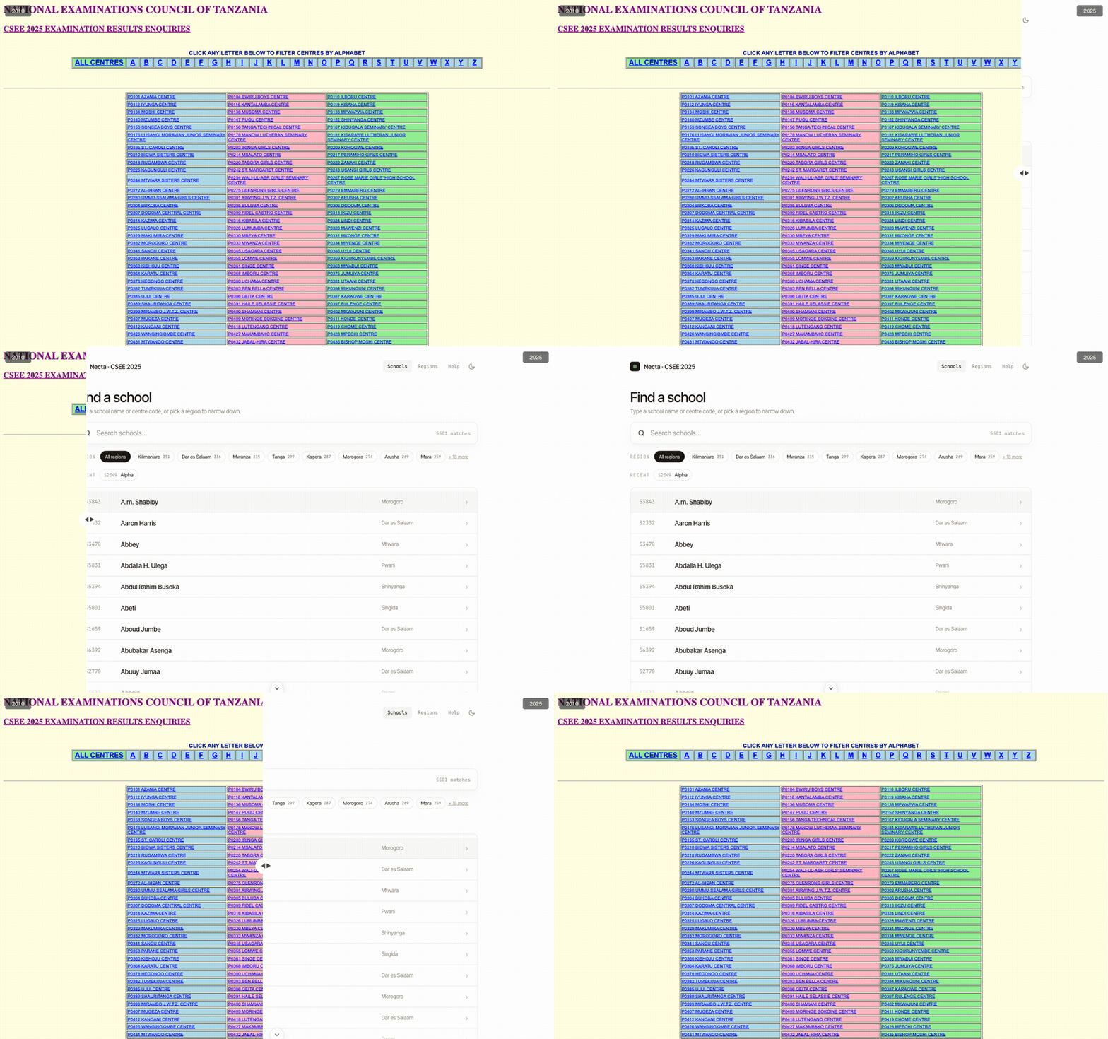
I sat my O-Levels in 2010. The NECTA results site hasn't changed since. So I redesigned it.
In 2010, I sat my O-Level exams. Results day came, and like every other student in Tanzania, I opened the NECTA website to find my grades. The experience was what it was: a dense HTML table, squinting at rows of CNOs and letter grades trying to find your name.
I recently opened that same site.
It looks exactly the same.
The real reason the redesign got built has a name and a subject: my sister, chemistry teacher at a well-regarded secondary school in Tanzania.
Her school ties teacher performance metrics to student performance, specifically to how many students achieve A or B grades in their subject. Every results cycle, she sits down and manually works through the NECTA tables, student by student, tallying subject grades. The data is all there. It’s just buried in a format that makes extraction painful.
That conversation shaped several decisions. The Subjects tab shows per-subject grade distributions, pass rates, and GPA in a single view. The Export button produces a clean report you can actually hand to someone. The gender breakdown exists because that lens matters to educators tracking equity in their classrooms.
None of these features are technically complicated. They just required someone to ask: who actually uses this data, and what do they need from it?
The constraints that shaped it
The architectural decision I’m most pleased about isn’t a feature. It’s that the redesign mirrors NECTA’s URL structure exactly.
Where NECTA serves onlinesys.necta.go.tz/results/2025/csee/results/s5952.htm, the redesign serves /results/2025/csee/results/s5952, the same path, no .htm. A request comes in, the site scrapes that page from NECTA on demand, parses it, caches the structured result, and renders it through a modern interface.
What that means in practice: when NECTA publishes the 2026 results, the redesign supports them on day one. No manual update, no migration. Provided NECTA keeps the same URL convention and HTML structure (which they have for fifteen years), the redesign stays current automatically. A small design choice with a long tail of value.
The interesting part is what I had to give up to run it cheaply. The whole thing lives on Cloudflare’s edge, and that environment has sharp edges of its own.
Parsing HTML without a DOM. The obvious way to extract data from an HTML page is to parse it into a DOM and query it. That tool doesn’t exist in a Cloudflare Worker: there’s no DOMParser. So I parse NECTA’s table markup with regular expressions, straight off the raw HTML string.
If you’ve been writing code for a while, your instinct here is correct: parsing HTML with regex is usually a mistake. HTML is too irregular, too nested, too willing to surprise you. But there’s exactly one situation where it’s the pragmatic call: a page whose markup has been frozen for fifteen years. NECTA’s tables are boringly consistent, and boring is precisely what makes them safe to match. The parser is also defensive throughout: markup it doesn’t recognise yields an empty structure rather than an exception, so a malformed or half-published page degrades gracefully instead of returning a 500.
Not becoming an attack vector. The site fetches a URL that’s ultimately derived from what a user typed. That’s the textbook setup for a server-side request forgery (SSRF) attack. Left unguarded, someone could coax the server into fetching internal addresses on their behalf. So before every outbound fetch, the code checks one thing: that the host is exactly onlinesys.necta.go.tz, over HTTPS, and nothing else. It’s a few lines. It’s also the difference between a scraper and a liability.
Scrape once, serve forever. Last year’s exam results don’t change. That makes caching almost too easy: the first request for a school scrapes and parses the page; every request after that is a database read. Results are cached in Cloudflare D1, keyed by exam, year, and centre code. There’s a ?force=true escape hatch to bypass the cache and re-scrape when I need to, but in normal operation, NECTA’s servers get hit once per school, ever. That’s what makes “supports 2026 on day one” cheap rather than expensive.
Two messy datasets, one centre code
A results page tells you how a school’s candidates did. It doesn’t tell you where the school is, who runs it, or what region to compare it against. That comes from somewhere else: the TAMISEMI dataset, a government spreadsheet covering all 5,500-odd secondary schools, with region, council, ward, coordinates, and ownership.
Joining the two should be trivial: both sides carry the exam centre code, so you match on that. The wrinkle is the names.
TAMISEMI’s names are ALL-CAPS and occasionally misspelled: “FLORANCE GIRLS” for what NECTA calls “Florence Girls’ Secondary School.” NECTA’s name is the authoritative one. So every time a school’s results are scraped fresh, the directory quietly reconciles itself toward NECTA’s spelling: the name gets overwritten, the region is kept from TAMISEMI where it’s already there, and schools that aren’t in the TAMISEMI seed at all (private centres, mostly) get added to the directory the first time someone views them. Search, the index, and recent-views all converge on the corrected name without anyone touching it.
None of this is glamorous. It’s the unphotogenic 80% of working with public data: two sources that almost agree, and the small amount of care it takes to make them actually agree. But it’s the part that decides whether the thing feels trustworthy or not.
What the data can say that the table can’t
Here’s the part that brings it back to my sister.
The original site shows you grades. The redesign derives things grades imply but never state. Three of them are worth naming.
Division-boundary uplift. For every candidate sitting one or two aggregate points below the next division up, the site flags the single weakest of their counted subjects as the lever: the place where a one-grade improvement would actually move them up a division.
Subject correlation. Across the whole cohort, which subjects move together? The site computes the correlation between grade points in every pair of subjects, so you can see (for this school, this year) whether the students who do well in physics also do well in mathematics, or whether the patterns are stranger than that.
Per-candidate consistency. Some students are even across every subject; others spike and crater. The site labels each candidate Consistent, Mixed, or Variable based on how much their own grades spread. A uniformly-C student and a student averaging C off straight As and Fs look identical on an aggregate. They are not the same student, and they don’t need the same help.
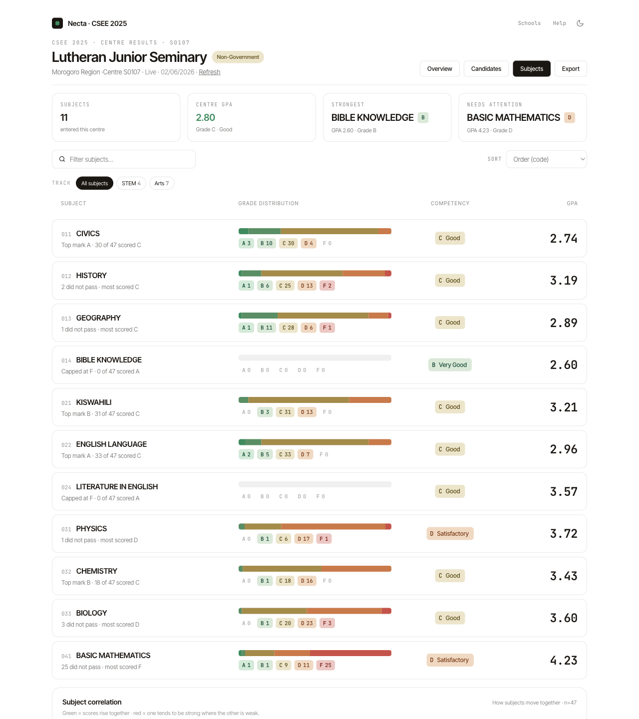
A note on honesty, because it matters: these numbers lie when the cohort is small. A correlation across twelve students is noise wearing a lab coat. So the comparisons are guarded by sample-size thresholds, and where the distribution is what’s interesting I lean on the median and the interquartile range rather than the mean and standard deviation. They don’t get yanked around by a single outlier. Showing a number you don’t trust is worse than showing nothing.
What’s still ahead
The features that would genuinely serve students, parents, and policymakers at scale (regional leaderboards, percentile rank, multi-year trends, public-versus-private comparisons, a national GPA distribution with a “you are here” marker) all need something the current design deliberately avoids: a bulk pass that ingests thousands of schools ahead of time, rather than one school on demand.
That’s a real jump. It’s more infrastructure, and it’s a genuine question about handling that volume of personal results data responsibly, not because it isn’t already public, but because aggregating public data changes what it can be used for. The roadmap is written down. The interesting work is still ahead.
Why this matters beyond the project
Tanzania has 5,500+ secondary schools. Their results are published publicly every year. That data, if made navigable, could tell important stories about regional equity, subject-level trends, the effect of teacher quality on outcomes. Right now it lives in HTML tables that require patience and a desktop browser to make sense of.
Public data deserves public tooling that meets people where they actually are: on mobile, in a hurry, looking for a specific answer.
My sister still teaches chemistry. Every results cycle she still needs to know how many of her students got an A or a B. She shouldn’t have to count them by hand.