Figure 06 · SHAP beeswarm
Direction, not just rank.
Every dot is one listing. Position shows how much that feature pushed the predicted rent up (right) or down (left); colour shows whether the feature's value was high or low.
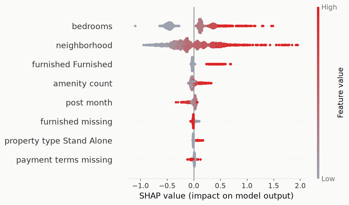
colour: red = high feature value · grey = low
The model is legible, and it agrees with intuition. More bedrooms and pricier neighbourhoods push rent up (red dots sit to the right); furnished units carry a clear premium. Beyond the top two features the dots collapse toward zero, visual confirmation that everything after bedrooms and location barely moves a prediction. A model whose explanations you can read and nod at is a model you can trust.